Grayson Sky
DESIGNED THROUGH GRAYSON SKY
Art Director: Rachel Rehrig | Copy Writers: Elizabeth Roan and Jeffrey Heinbach
I rebranded Grayson Sky, a boutique marketing & advertising agency based in Old City Philadelphia. My main task were reworking the logo, establishing a style guide, and redesigning the website.
Logo:
My main goal when approaching this redesign was to used refined shapes and geometry. I wanted a broad sense of simplicity and reserved-form. Updating the typography was another large factor in the redesign. My vision was to deliver a timeless, clean, and approachable logo.
Color Palette:
Though primarily visualized through an almost black & off-white palette, the brand color spectrum is full. The entire spectrum gradient is to be used often though in a proportionally small manner. The cobalt blue is the brand’s main spot color and pays homage to the original bright sky blue color of the brand.
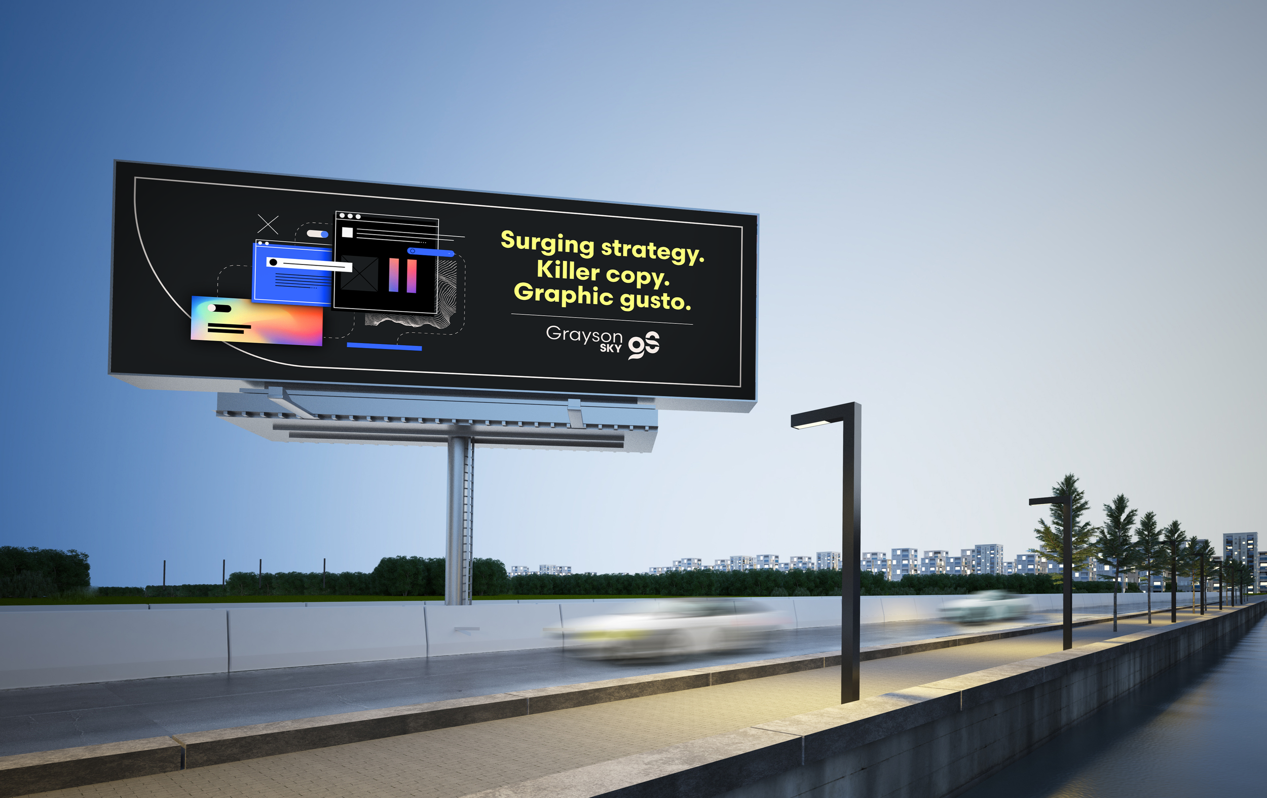
OOH Advertising Examples:
UI Design:
The website was due for an upgrade as well. The design needed to be intentionally simplistic and easy to navigate as well as illustrative in conveying creative ability. I aimed to showcase the brand gradient with faded grain overlays and also introduced a branded icon design suite for unique graphic elements.
With custom coding from the help our development team, we achieved subtle and tasteful animations, natural scrolls, and an overall graceful web experience.
Icon Suite:
Throughout the Grayson Sky website and other branded documents like decks, social posts, and blogs. I established an abstract, bespoke set of icons to illustrate concepts, directions, and items.
Business cards
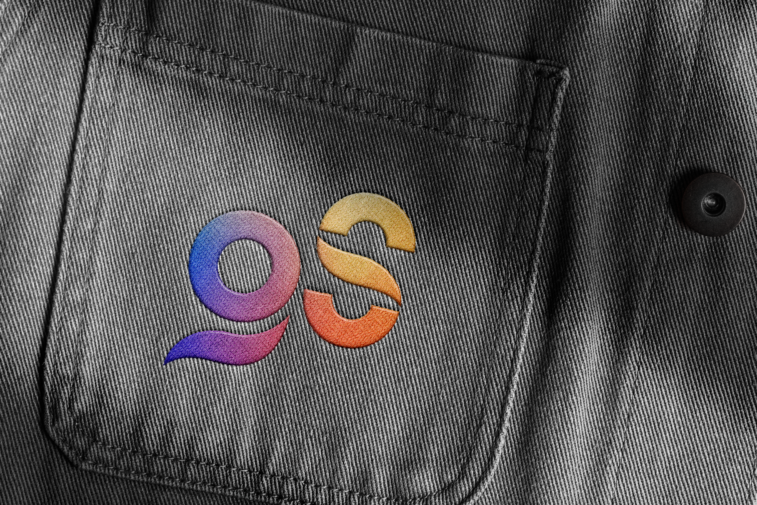
Merch
Complete Brandbook:


